Real Media Products

(shot 1: Title) This is a screen grab of the titles from 'The Godfather', this title is centred and placed in the middle of the page this therefore creates the feeling that it is important as it is the only thing the audience will see on the blank screen, also by having the font in white on a black background it therefore further emphasise its importance to the film they are watching.
(shot 2: Location) This is a shot from 'casino' this has an long/mid shot and shows the main character leaving one of his casinos in Las Vegas panning with him therefore giving the audience a glimpse of his surroundings, by having this shot of it subconsciously gives the audience the effect of the surroundings and where all the action will be.
(shot 3: Camera work and editing) This is a shot from 'Donnie Brasco' and shows an extreme close up of the characters eyes, this gives an effect that the eyes have seen a lot and therefore can connote the feelings of the character easily. This also is in black and white (editing technique) this therefore creates the effect that either it is through surveillance or it is set in the past.
(shot 4: Costumes and Props) This is a shot from 'the godfather' and you can connote a man dressed smartly in black suit, this is a convention of the genre as people stereotypically think gangsters wear black. Also by having the man wearing black it connotes death, of which is commonly associated with the gangster genre.
(shot 5: Story/Narrative) The typical narrative of a gangster film is the story of a character rising up to take power of the criminal underworld, and have to battle through problems such as love, betrayal, death. This is a screen grab from 'Casino', which storyline is someone battling to keep power by doing whatever he can.
(shot 6: introduction of characters) this is a shot from 'Goodfellas' the characters in this are introduced in a dramatic event. they pull over in their vehicle and kill a victim they have been transporting in the boot of their car. this gives the audience the immediate feeling that these are the bad guys within the film.
(shot 7: Title Font and style) This is a shot from 'the Godfather' this font style is bold and has the tails of the letters reaching to each other, this creates the effect that the story will have a bold character or storylilne that will entice the audience, also by having the letters reaching for each other it connotes that every action has a reaction leading to other occurances through out the film.
(shot 8: Special effects) this is a screen shot from 'casino' a car exploding can be denoted. This therefore connotes to the audience that the film will have action/drama through out and therefore attracts the audience as this is what they look for in films, also by having good special effects It can connote that the film is big budget and therefore implies that it should be good.
(shot 9: Genre and how the opening suggests it) this is a shot from 'Donnie Brasco' and it has a flickering effect showing what seem to be various surveillance shots that would be taken by police. this gives the effect that this is a gangster film as stereotypically gangsters are always under surveillance and trying toi be busted by the cops.
Our Media Product

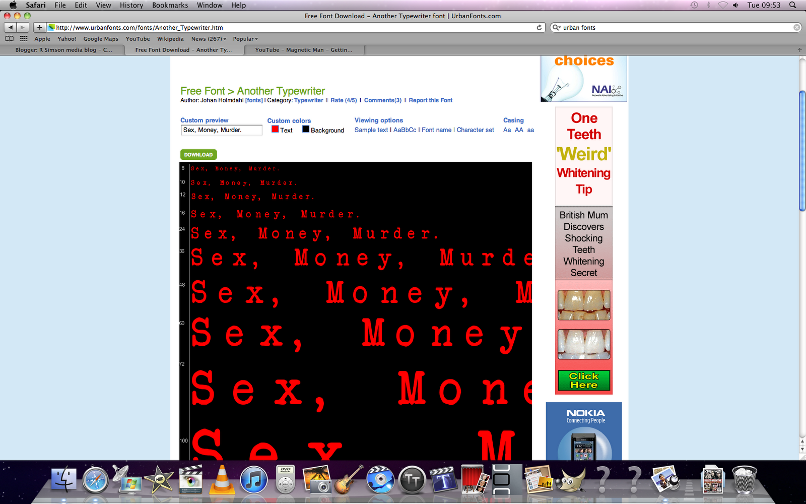
(shot 1: Title) This is a screen grab of the titles from our media piece 'Sex, Money, Murder.', this title is centred and placed in the middle of the page this therefore creates the feeling that it is important as it is the only thing the audience will see on the black background of the screen, also by having the font in white on a black background it therefore further emphasise its importance to the film they are watching. This is using the convention of gangster films for titles (black background, white text) that is used in many films within the genre.
(shot 2: Location) This is a shot from 'Sex, Money, Murder.' this has a mid shot and shows one of the supporting characters within the film arriveing to the main characters house, this is also following him therefore giving the audience a glimpse of his surroundings, by having this shot of the character it subconsciously gives the audience the effect of the surroundings and where all the action will be. This technique has been used in other gangster films before such as casino, to show settings/location in the opening sequence, we used this cinvention.
(shot 3: Camera work and editing) This is a shot from our media piece 'Sex, Money, Murder' and shows an extreme close up of the main characters lips, this gives an effect that the lips will be used during the film to create an important event, this also is in black and white (editing technique) this therefore creates the effect that it is set in the past, we followed this convention.
(shot 4: Costumes and Props) This is a shot from our piece and you can connote a woman dressed smartly in a black dress, this is a convention of the genre as people stereotypically think gangsters wear black. Also by having the woman wearing black it connotes death, of which is commonly associated with the gangster genre. Black clothing is a common convention in gangster films, and we decided to use this convention.
(shot 5: Story/Narrative) The typical narrative of a gangster film is the story of a character rising up to take power of the criminal underworld, and have to battle through problems such as love, betrayal, death. This is a screen grab from 'Casino', which storyline is someone battling to keep power by doing whatever she can, this is following the genre convention, apart from the main character is a woman in stead of a man, so we followed and challenged ths convention.
(shot 6: introduction of characters) this is a shot from our product the characters in this are introduced in a dramatic event. the main character starts off by killing a supporting cahracter, this gives the audience the immediate feeling that this character will be at the centre point of all the action within the film. We followed this xcinventiion as it would hook the audience and make them want to carry on watching.
(shot 7: Title Font and style) This is a shot from our media product 'Sex, Money, Murder.' this font style is bold and has the letters are seperated, this creates the effect that the story will have a bold character or storylilne that will keep the audience watching, also by having the letters seperated it connotes that within the film there will be many events that will cause various effects on the storyline.
(shot 8: Special effects) This is a screen shot from 'Sex, Money, Murder.' we could not follow this convention as using special effects was an unavailable option.
(shot 9: Genre and how the opening suggests it) this is a shot from our product 'Sex, Money, Murder.' it has black clothing, death and is in black and white, so by just seeing these conventions the audience can quickly realise the genre and what it will include.